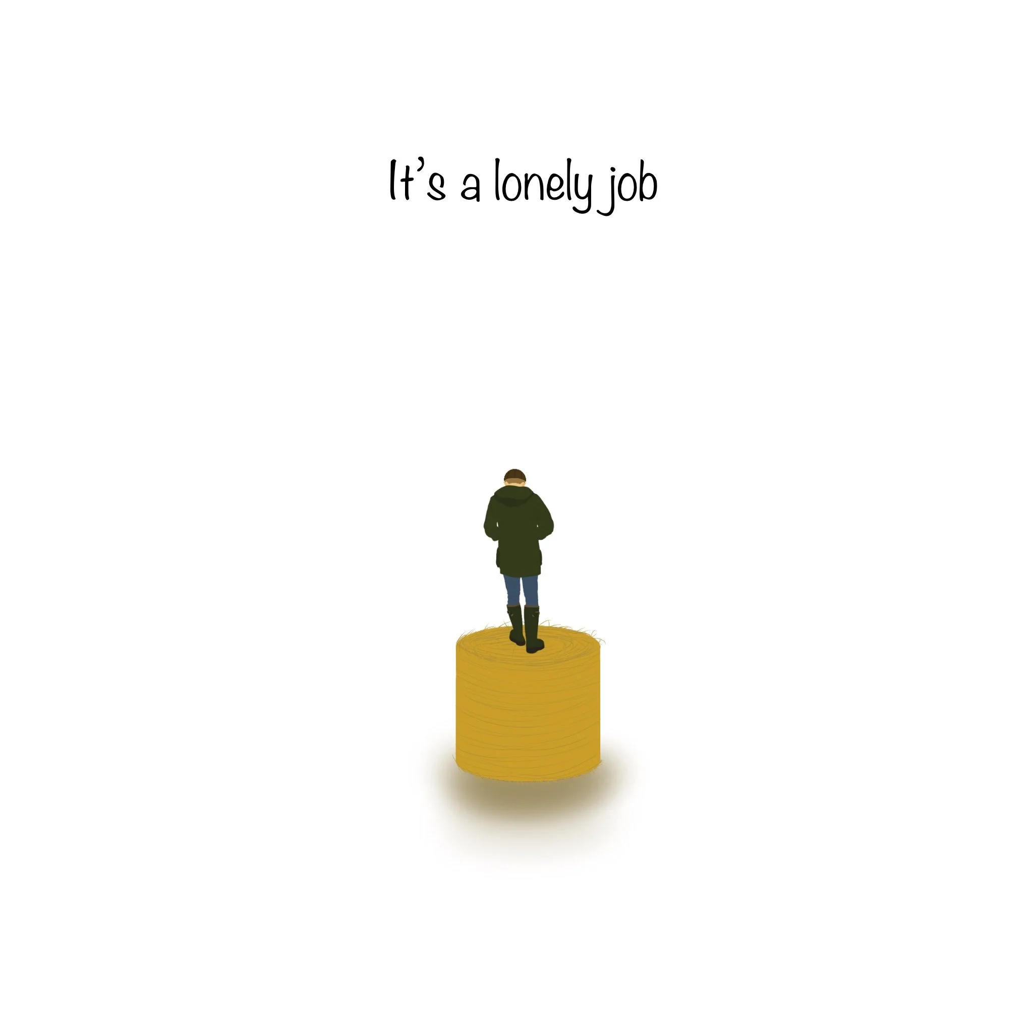
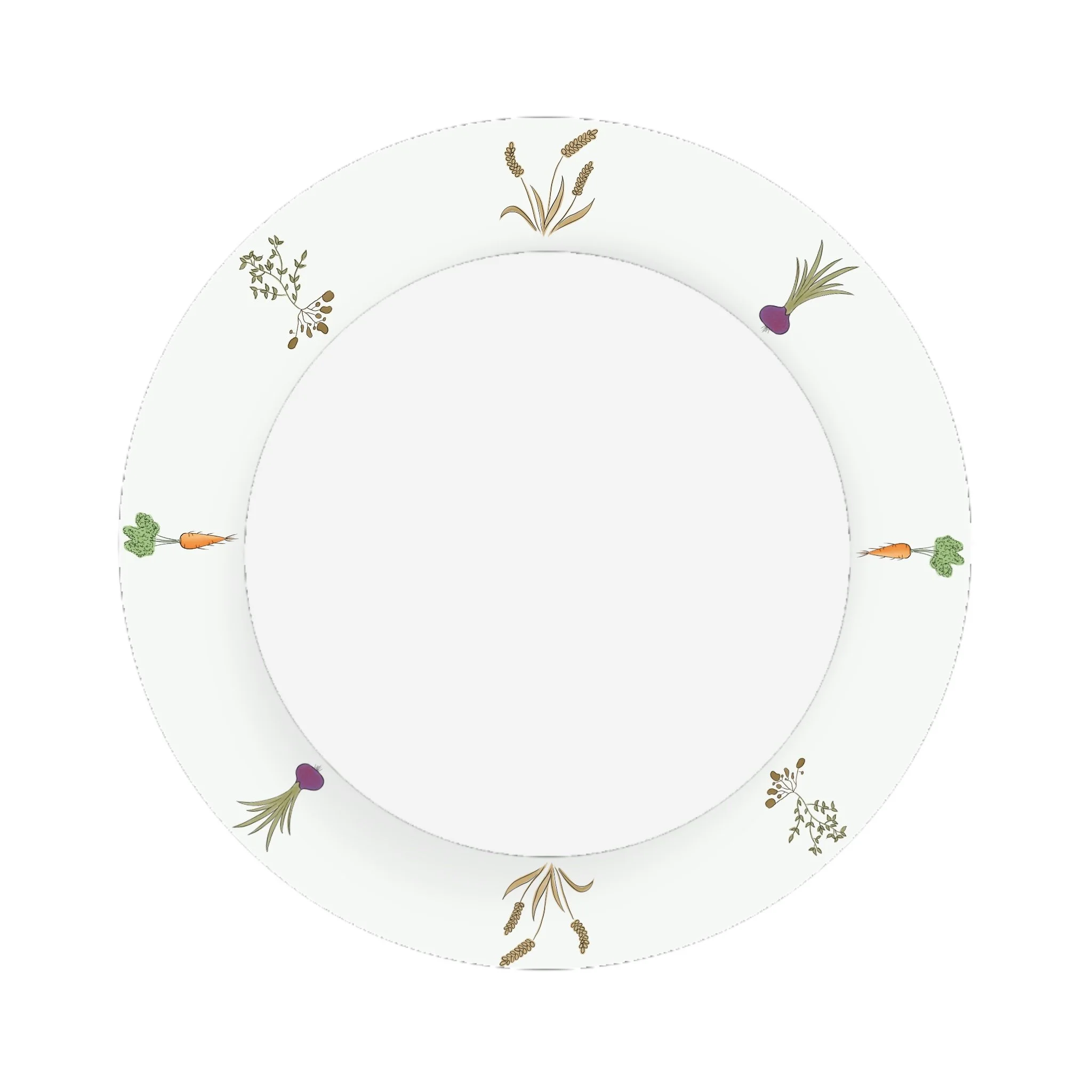
“I AM HERE”
I created this plate as an entry for the London Design Festival 2026, aiming to represent the often and most overlooked hardships faced by those in the farming community. While the design carries a visually striking and beautiful aesthetic, it also holds a deeper and more powerful message. Through this piece I want to highlight the immense contributions farmers make to our lives. I want to try and reflect the importance of mutual respect, support, and appreciation between us and those who work the land.

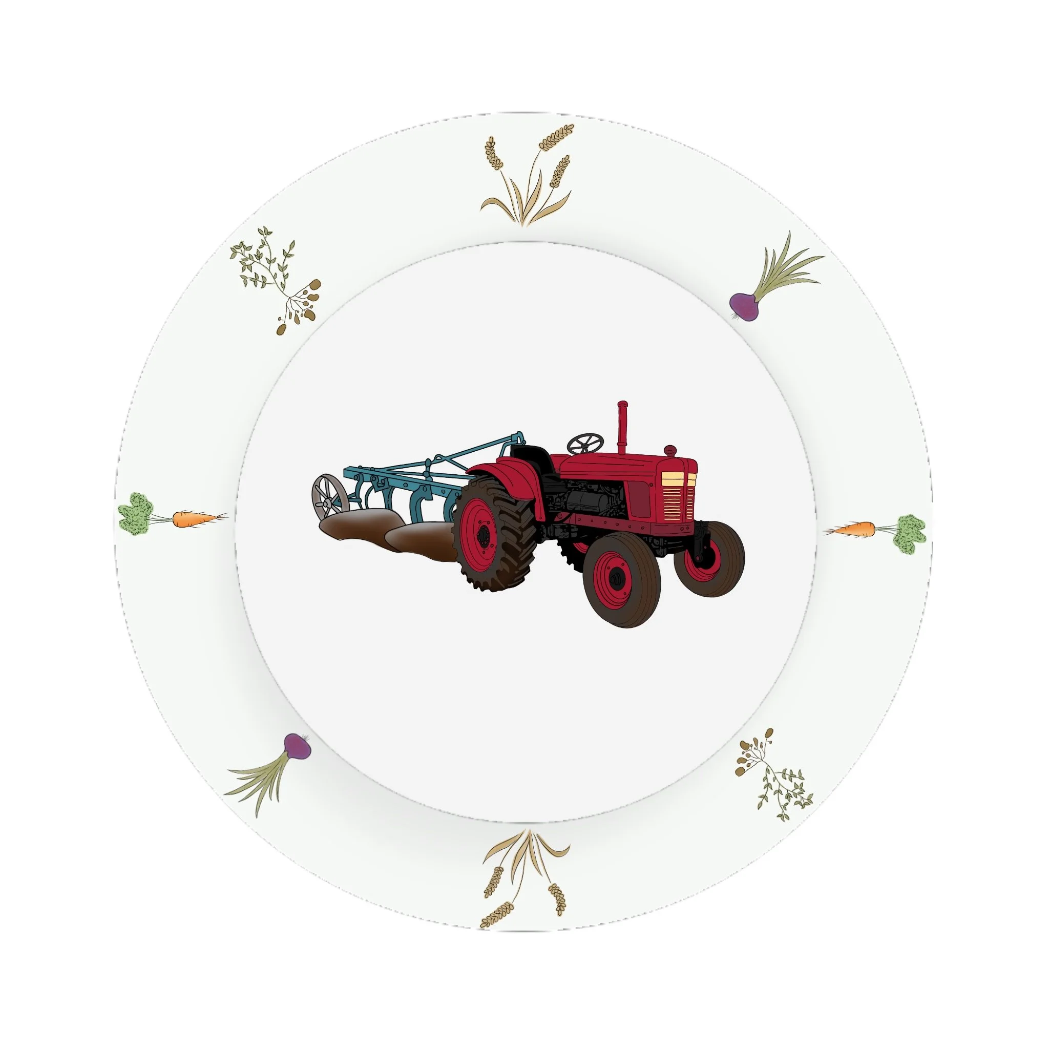
Farming in the 1930’s
I created this piece as one of my brief’s to portray the Great Depression. I used the tractor as farmers struggled to harvest their food due to cost issues as fuel was expensive so crops rotted in the ground.
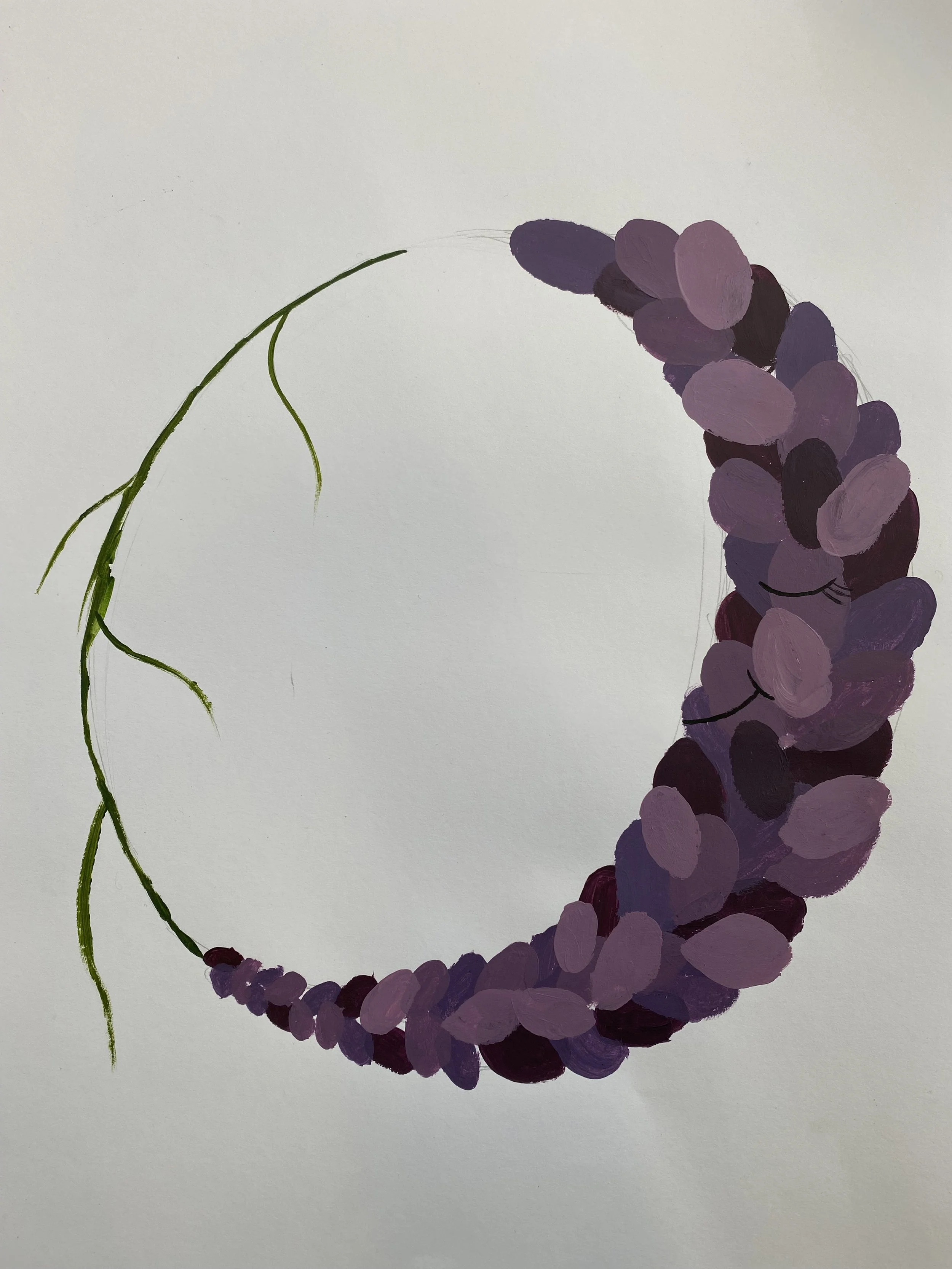
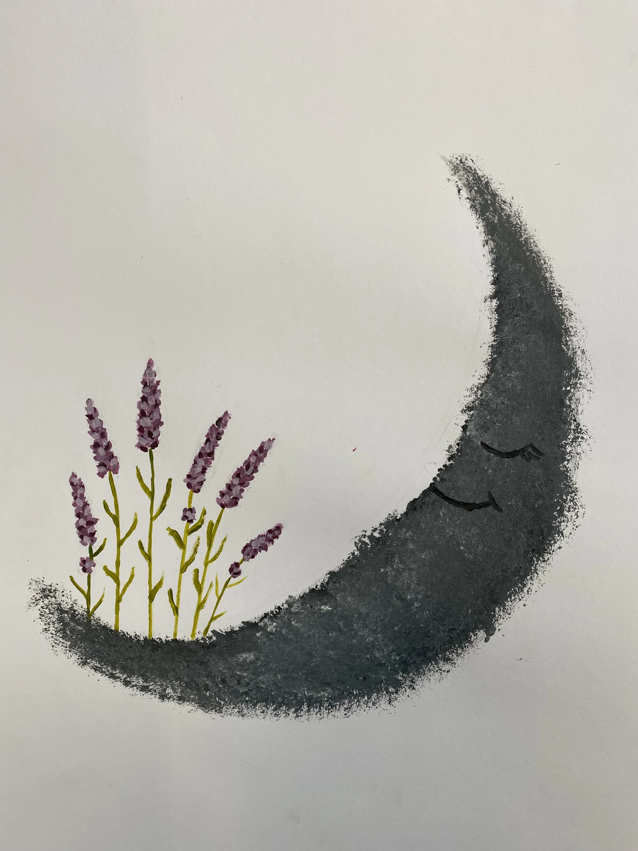
Sleeping Lavendar
I wanted to show how herbs can help with medical issues and help with day to day struggles. Lavender can be beneficial and helps people with insomnia so I painted a sleeping lavender shaped as the moon.

Christmas Foliage
I wanted to portray the greens of Christmas. The red ribbon, holly, red berries and pine. Capturing the Christmas colours within my work. I used water colour for this.

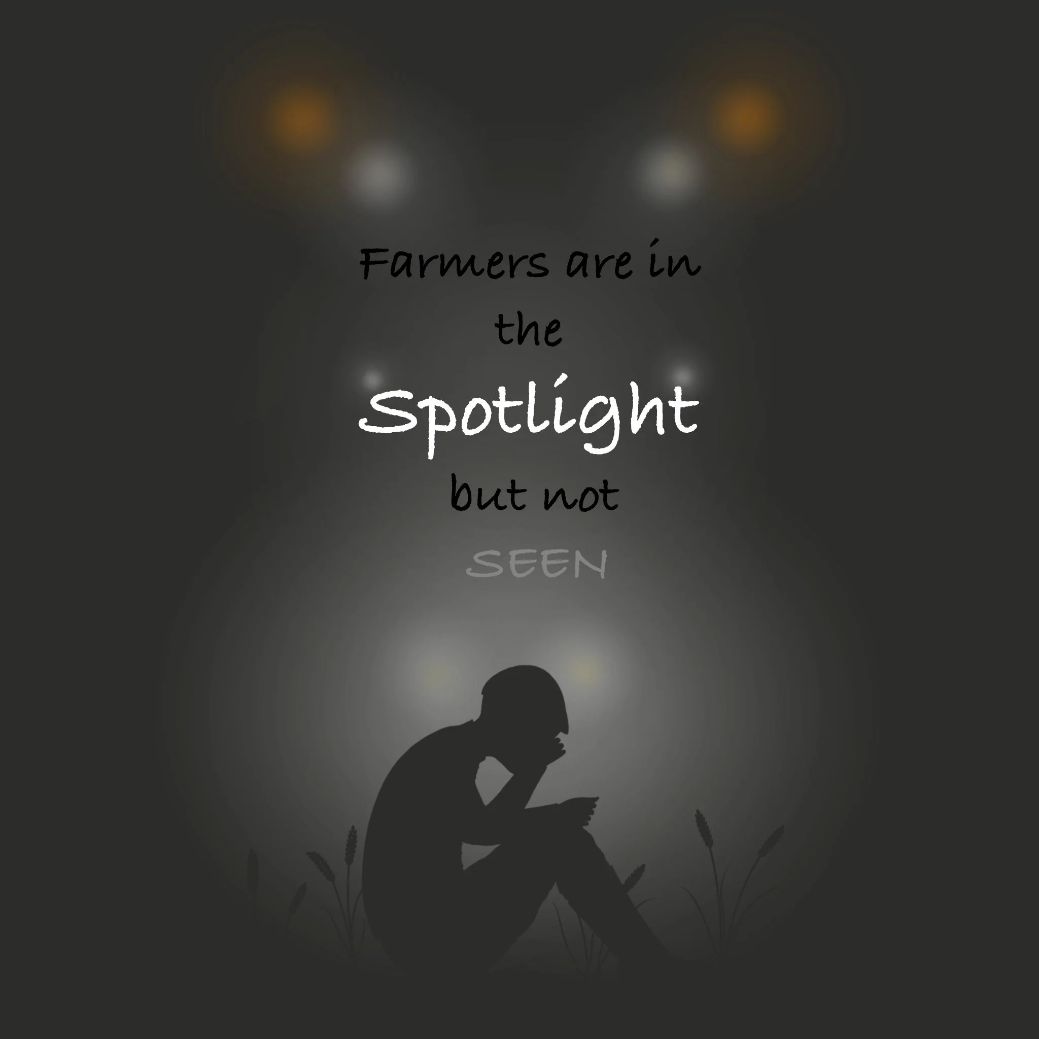
“I AM HERE”
This is another plate I designed for the London Design Festival 2026 competition. Like the previous piece, I emphasise the importance of caring for those who care for us who our, our farmers. Too often, we overlook the individuals who put in the relentless effort to ensure we have food on our plates. Many underestimate the dedication, labour, and sacrifice that goes into producing what we eat. Through my work, I hope to bring greater awareness and appreciation to their vital role in society and this country.

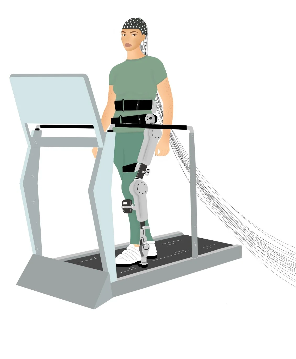
BCI Hero
I explored the way BCI’s have helped people with disabilities learn to regain movement either from an accident or medically.
Sleeping Moon Garden
Another example of lavender helping people sleep better. I did a moon to highlight the responses to the herb. Instead of using the lavender itself to be the moon I experimented with the moon and added texture to add more depth

Christmas Colours
Following from the Christmas theme I painted a present with the same greens and red. Making the magic happen at Christmas.

Chippen
Here I experimented with shadowing and how the light hits different parts of an image. I played around with silly chicken drawings. I made it a cartoon as I wanted to experiment with cartoon drawings.

Testing
Previously, I experimented with presenting a tractor in both black and white and in colour to see how each version appeared on the plate. After careful consideration, I found that the black and white design was more effective. To me I found that it doesn’t distract from the background, allowing the overall illustration to retain its focus. Most importantly, it draws attention to both the outline of the plate and the accommodating text, which plays a key role in communicating my message.